How to filter data points
There are four ways to filter your data while exploring:
- By tags
- By time
- By coordinates
- By acoustic values
Often, you will find a bold green number in visualisation panel sidebars.
Hover it to display a tooltip allowing you to check filtering state at a glance.
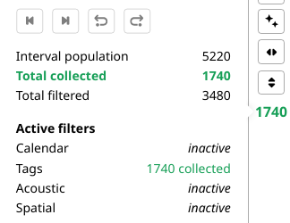
Clicking on that number will cycle its display between collected (visible) and filtered (hidden) audio intervals.
Tag filtering
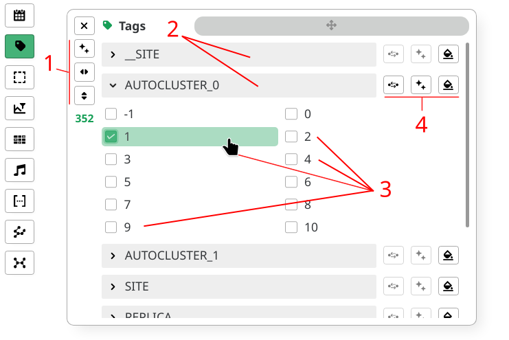
- Open the
Tagspanel - Adjust panel size with sidebar buttons (1)
- Expand and collapse by clicking on tag names (2)
- Select tag value combinations you want to include (3)
- Run quick state actions for each tag (4)
Tag filtering is also available via the Heatmaps panel.
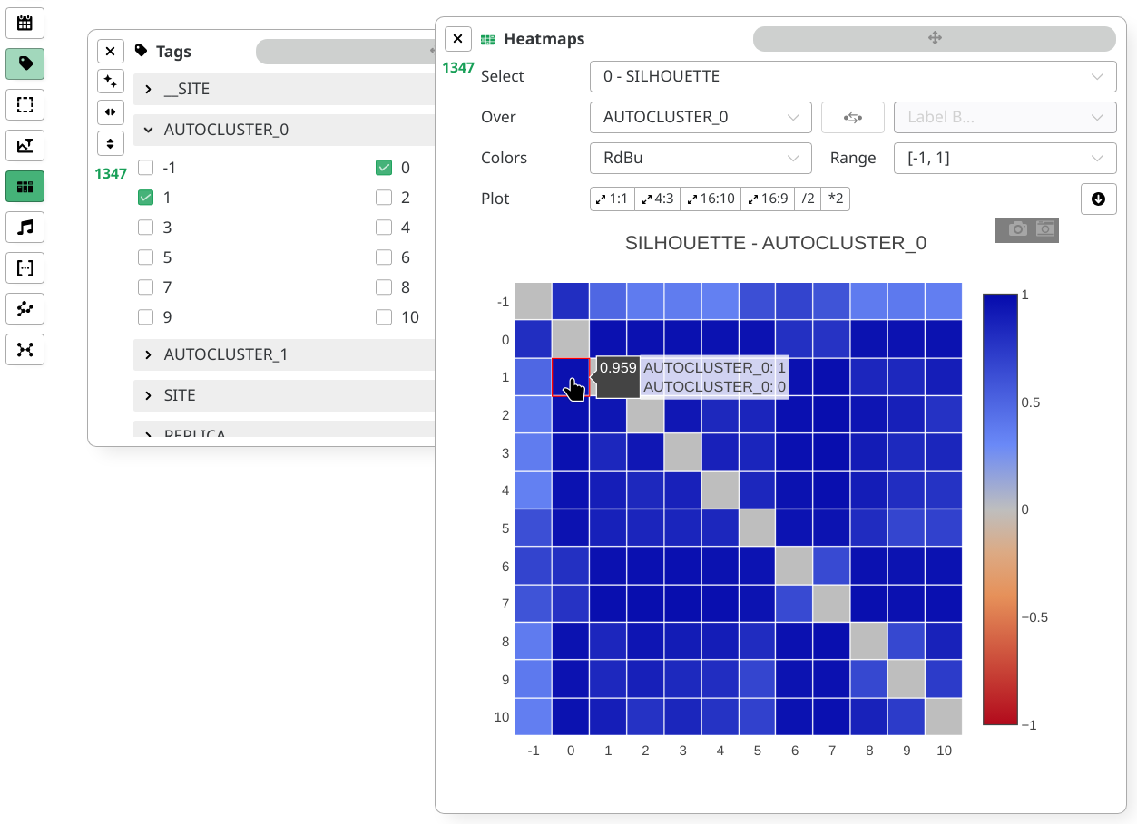
Click on a heatmap square to trigger a toggle shortcut to the associated tag values.
Calendar filtering
- Open the
Calendarpanel - Adjust window size
- Using presets (1)
- Or manually (5)
- Transport window (2)
- Select range
- Using range defined during
Campaignconfiguration (3) - Or by manually entering dates (4)
- Using range defined during
Calendar view has 2 sections:
- The track displaying the selected range
(6)
and the window position
(5)
- Each red line indicates interval presence
- The actual window content (7)
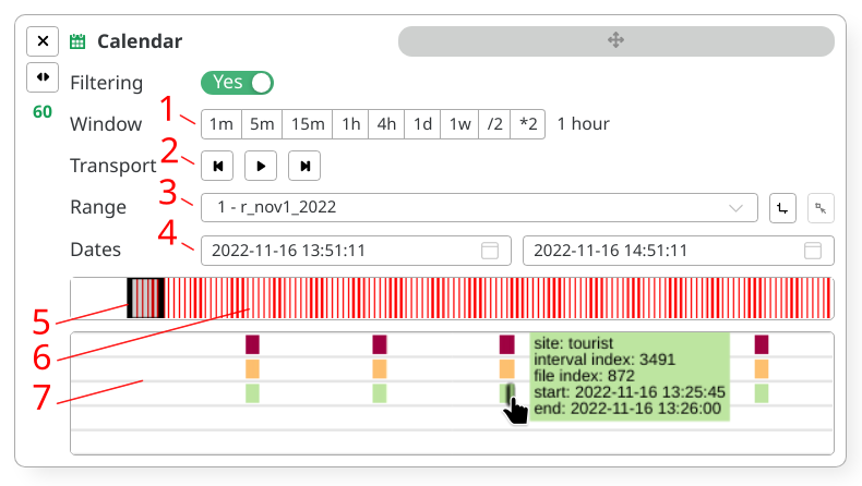
Window content displays intervals across sites. One site per row.
Clicking intervals trigger the Audio player,
as if you clicked on their scatter representations.
Color coding in calendar window content has no relationship to actual scatter coloring.
Spatial filtering
- Open the
Selectionpanel - Add a new box by pressing the
+button (4) - Select your new box index in the dropdown menu (5)
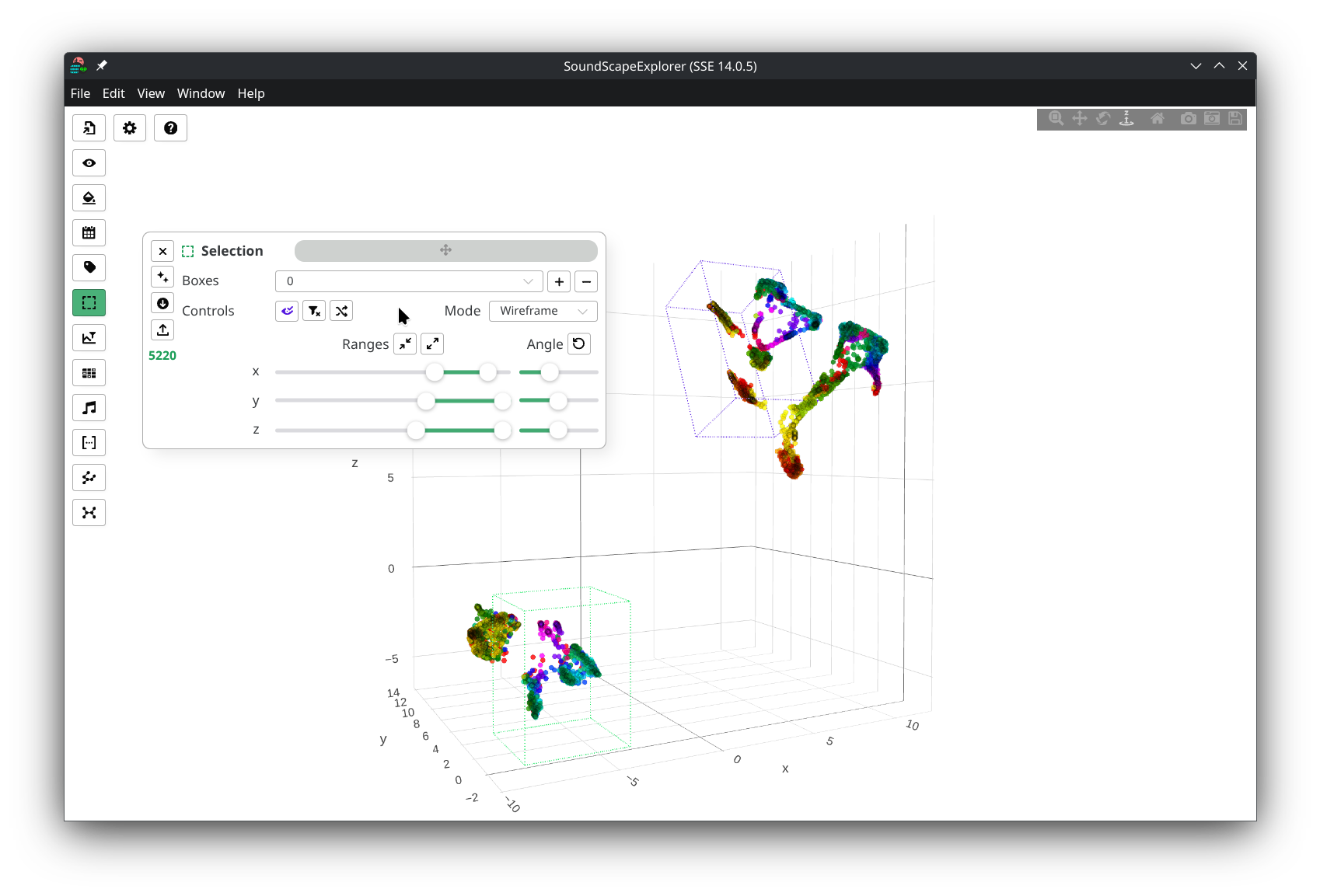
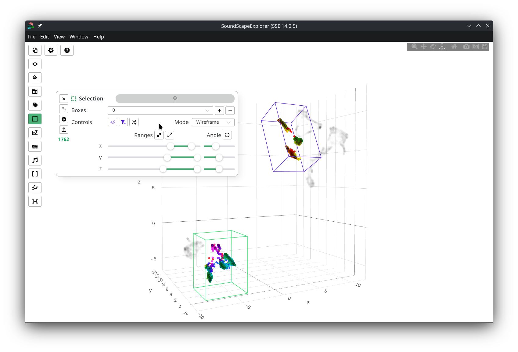
You will end up in the following view:
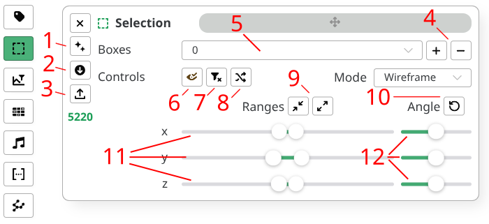
You can now edit your current box parameters using:
- Quick controls
- Toggle box rendering to the scatter (6)
- Toggle box filtering (7)
- Randomize box color (8)
- Spatial controls
- Adjust axis ranges (11)
- Adjust axis angles (12)
- Minimize or maximize all ranges (9)
- Reset angles to 0° (10)
You can have multiple boxes loaded with different rendering and filtering state.
Once done, use the sidebar buttons to interact with the boxes state
- Clear all boxes at once (1)
- Download boxes to a local
.jsonfile (2) - Load existing boxes from a local
.jsonfile (3)
Selection boxes are automatically saved into your visualisation app.
This internal sync mechanism caches your data based on your current configuration hash and selected view.
Beware that local storage does not carry around version updates.
Use export functions to sideload accordingly.
Examples
- Multiple boxes OFF
- Multiple boxes ON
- JSON export
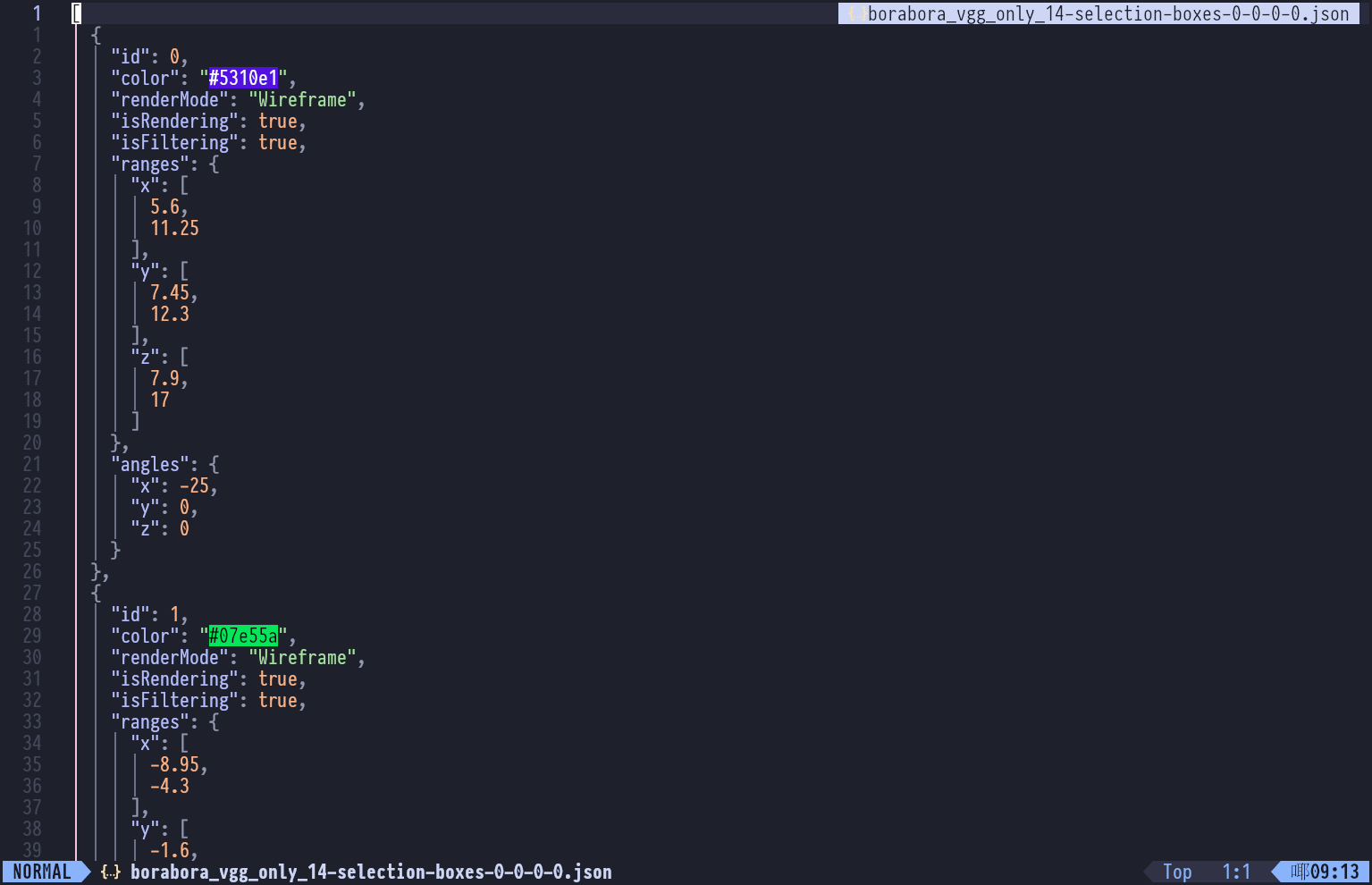
Filename uses the following naming convention:
[config-filename]-selection-boxes-[extraction-index]-[band-index]-[integration-index]-[reduction-index].json
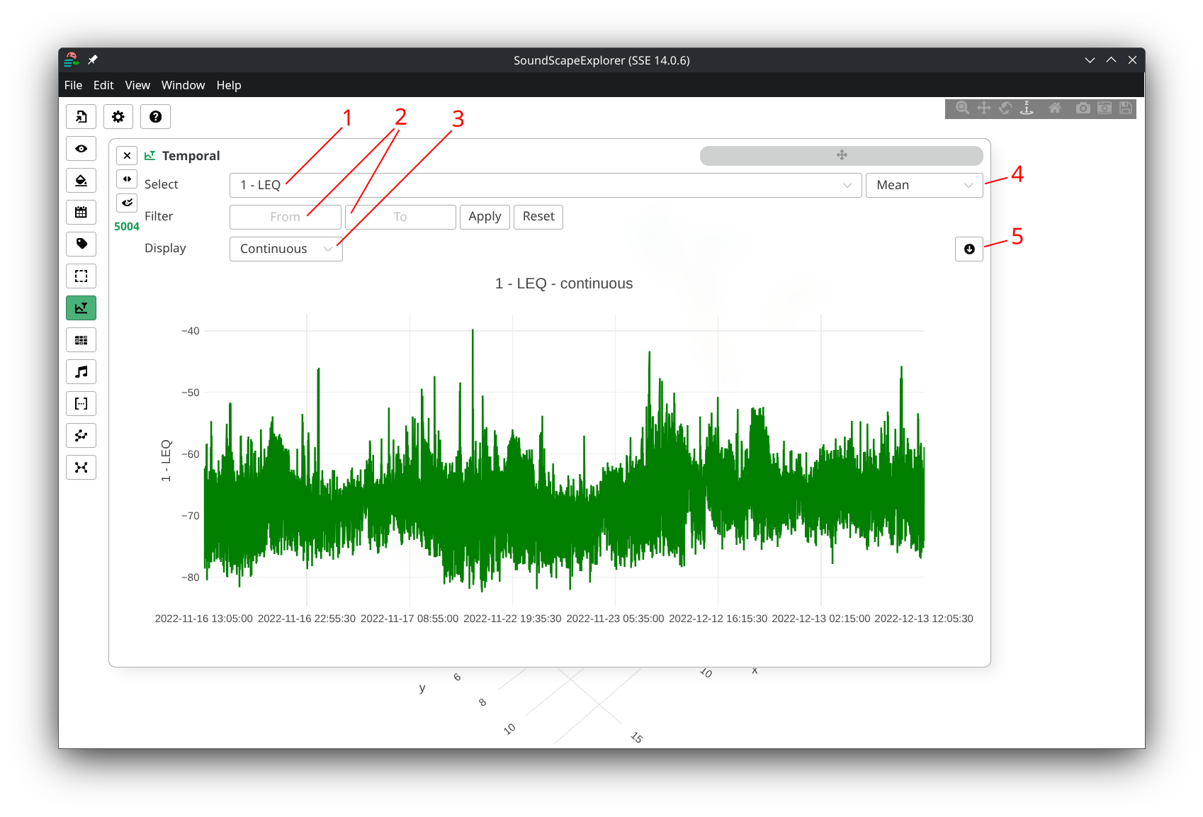
Temporal filtering
- Open the
Temporalpanel - Select an acoustic indicator in the list (1)
- Wait data to load from HDF5 storage, you will get the following render
- Change how values are aggregated and plotted
(4)
- mean values
- min values
- max values
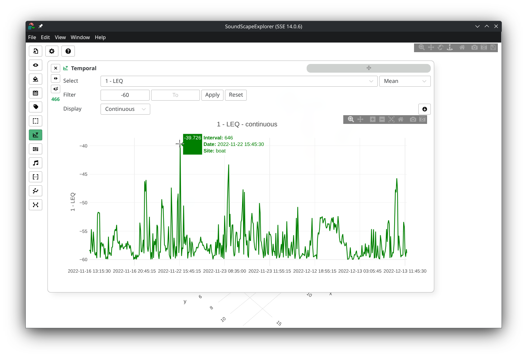
- Enter filtering boundaries, then press Enter
or click on
Applybutton to apply filtering. (2) - Export plot to
.csv(5) - Change rendering mode (3) between
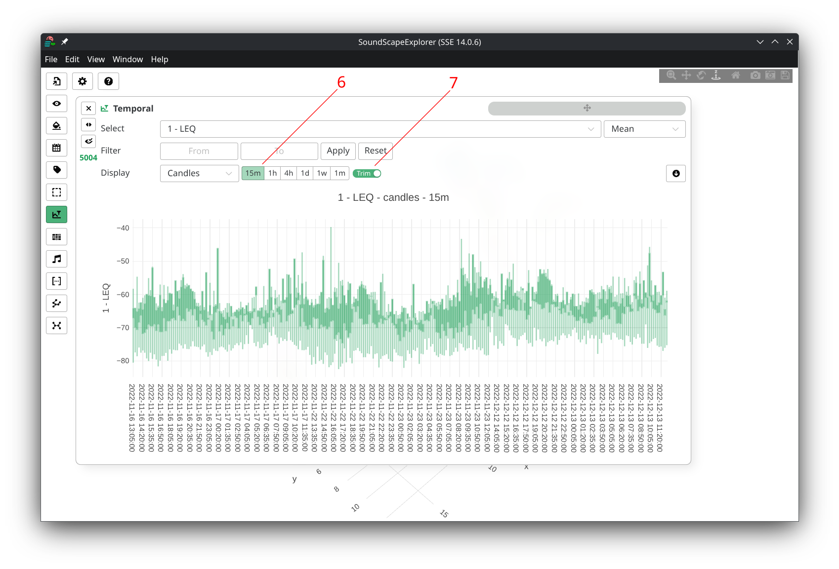
- Continuous plotting: Shows individual data points for each interval. Click any point to open the Audio player for that specific interval. Best for detailed analysis of individual measurements.
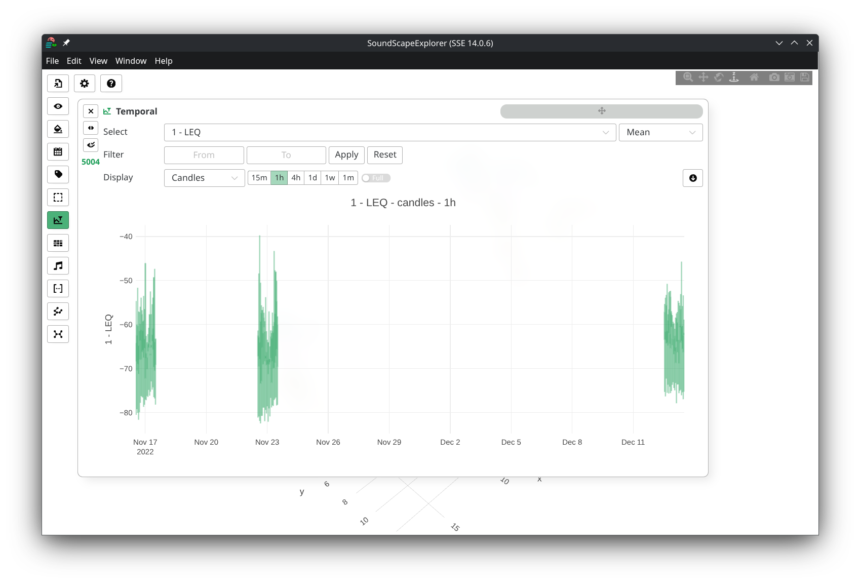
- Candles plotting
(candlestick charts):
Groups data into time buckets, showing the range
(min/max) and first/last values for each period.
Useful for identifying patterns and trends over time.
- Allows you to define candle size (6)
- Use the
trimbutton (7) to toggle empty time spans plotting
- Continuous plot
- Candles plot (15 min)
- Candles plot (1 h)
- > -60 dBFS Leq filtering